An in-depth look at various currencies and their charts as well as observations on energy commodity prices and how they’re affected by world events.
Watch This Episode On YouTube or Rumble
Listen To The Episode Here:
In this episode of the “Fed Watch” podcast, we focus on important macro charts. We cover bitcoin’s chart, currencies like the dollar, the euro, the Hong Kong dollar, and gold as well as energy commodities. We didn’t have time to get to all the charts I prepared, because the live show has time constraints. I will attempt to get a second part out this week to cover the rest of my commodity charts, as well as supply chains and shipping costs. You can find the slide deck of charts here.
Other topics covered in today’s episode include President Joe Biden and Federal Reserve Chair Jerome Powell’s meeting yesterday, where I try to flesh out the importance of this Wall Street (Powell) versus globalists (Biden) showdown, and we get into a couple of things from Davos last week, particularly the Kissinger comments about Ukraine.
“Fed Watch” is the macro podcast for Bitcoiners. Each episode we discuss current events in macro from across the globe with an emphasis on central banks and currency matters.
Currencies
The first currency we talk about is bitcoin. I discuss the recent pop in price on Memorial Day, and how it is simultaneous with a growing bullish divergence in the indicators.
However, I also go back in time to roughly one year ago, when there was a very similar situation. In June 2021, there was a bullish divergence in these two indicators and a breakout of a descending wedge. That move was a fake out, cut short by the Grayscale (GBTC) unlock wave in July. The current situation is similar on the chart, but not similar in the fundamentals. I just wanted to point out a previous example where a breakout like this week failed.
I make an effort to dislodge the “bitcoin rise equals dollar collapse” false narrative here. The dollar and bitcoin can rise together due to deflationary pressures pushing people to cash and away from counterparty risk.
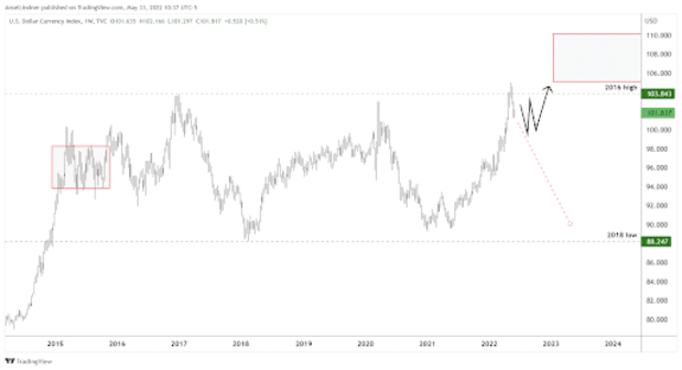
Next up is the dollar. On the live stream, I show the following chart and discuss how we could be headed for a new higher range on the dollar. Perhaps we see another five to seven years of the dollar index (DXY) in a range of 100-110, kind of like how it jumped into the 90-100 range in 2015.
For many who don’t like DXY because it is too narrow (euro 57.6%, yen 13.6% and pound 11.9%), I provide a chart of the trade-weighted dollar that includes 30-plus currencies including the Chinese yuan and Mexican peso.
In the below chart, we see the same consolidation beginning, but the high that the dollar achieved (excluding the COVID-19 crash highs) is a new high. I think this symbolizes a stair-step function higher for the trade-weighted dollar as well.
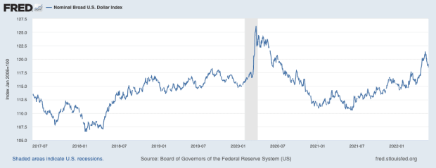
Remember, a strong dollar is the Fed failing and it also provides massive stress to the rest of the world’s economy.
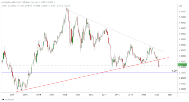
The euro is nearly the inverse of the DXY. It also shows a recent breakout, but in this case downward. If the dollar rally is to consolidate before heading higher, the euro is going to consolidate before heading lower. One thing is for sure, the euro has broken its two-decade support trend line and it’s in big trouble of crashing much lower.
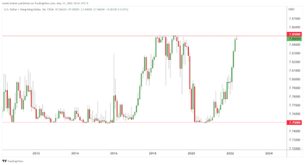
The next two charts are of the Hong Kong dollar versus the U.S. dollar. There is a peg in place that is plainly obvious on the first chart: It is a range between 7.75 and 7.85. Recently, the exchange rate has raced to the top of this pegged range, signaling massive dollar pressure in the Asian economies like China, Hong Kong, Taiwan, Japan and South Korea. The dollar squeeze rapidly started this year.
The second chart of the Hong Kong dollar is a close up of the daily timeframe. The peg was defended successfully this time, by the authorities selling U.S. dollars and buying Hong Kong dollars, but the big question is do they have enough reserves to continue defending this peg for the rest of the year, like they did in 2018?
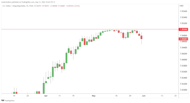
The Hong Kong authorities publish their reserve data, so we can get a clue to the severity of their predicament. At the end of April 2022, prior to the peg experiencing its greatest pressure, their reserves stood at $465.7 billion, $16 billion less than March.
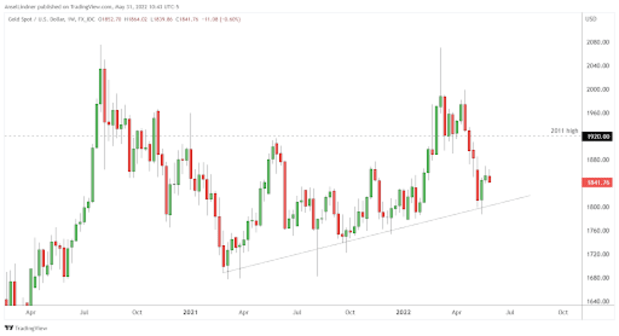
The last currency we look at is partly a currency and partly a commodity: gold. It has been hard being a gold bug for the last 11 years. Currently, the gold price is below the 2011 high of $1,920, sitting at $1,840 at the time of recording. Imagine, holding gold for 11 years and losing money despite the narrative of money printing. Your choice at that point would be either abandon your faulty inflation dogma or go crazy on conspiracy theories. That sums up the gold community at this point, in my opinion.
Energy Commodities
Moving onto commodities, on this episode, I only have a chance to cover two charts. The first is Brent crude (U.K. crude price in orange) and West Texas Intermediate (WTI) crude (U.S. crude price in blue). They often are extremely correlated, with a slight premium on European Brent.
I wanted to cover this chart today, because of the headlines about the sixth round of EU sanctions on Russian oil; it is an absolute joke. As you can see on the chart, the orange line actually drops on the day the theatrical sanctions were announced.
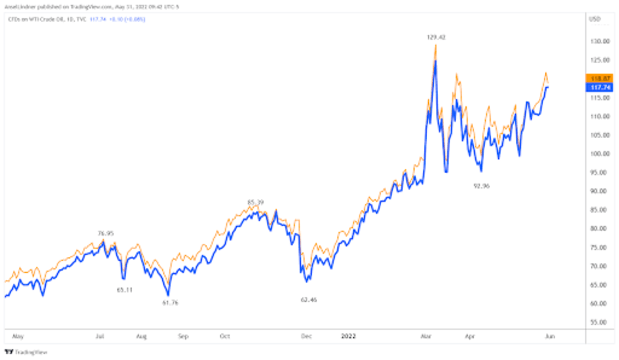
My thesis for oil prices is as follows: Global demand is collapsing faster than oil supply. Recent elevated prices starting in March 2022 are due to the conflict in Russia and Ukraine causing market uncertainty. Oil is very overbought. The price of oil will begin to fall soon, lowering prices and consumer price index (CPI), and coinciding with a growth slowdown. This is not a stagflation scenario, it is a deflationary depression scenario after a temporary spike in prices.
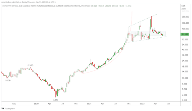
Natural gas futures in Europe support my conclusion. They have been radically elevated, far above rational market fundamentals apart from sanctions on Russia. Russia has refused to be affected by successive rounds of sanctions, and the chart is telling us that these price levels are mainly due to people’s worries, not market fundamentals. Once those worries go away (when the end of the Ukraine situation becomes more clear), prices will adjust downward quickly.
That does it for this week. Thanks to the readers and listeners. If you enjoy this content please subscribe, review and share!
This is a guest post by Ansel Lindner. Opinions expressed are entirely their own and do not necessarily reflect those of BTC Inc. or Bitcoin Magazine.

